- 手机:
- 18888889999
- 电话:
- 0898-66889888
- 邮箱:
- admin@youweb.com
- 地址:
- 海南省海口市玉沙路58号
最近由于工作中的一个项目,使我对自己充满了怀疑,究竟什么TM的叫科技感?不同的应用场景,科技感是否还依旧有效?同展示条件下不同应用场景,又会有什么样的差异?
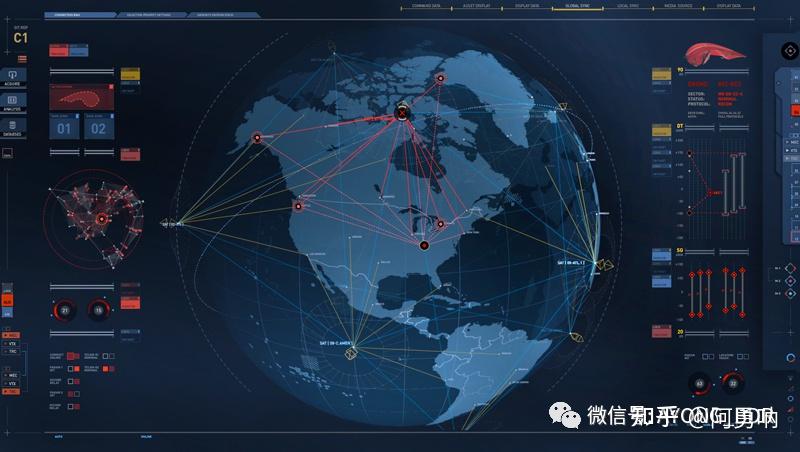
最近在做的一个卫星地图可视化项目,使我对科技感有了更多的认知,究竟是什么样子的设计,才能被“甲方爸爸"认定为科技感十足,并且很酷炫呢?(此处忽略我改稿无数次,也崩溃了无数次,无数次的问自己:怎么才能让页面变得更有科技感?怎么才能酷炫?)被逼无奈,只能自己总结,多总结一些经验,就可以少走一些弯路~
相信很多可视化设计师听到最多的一句话:要酷炫,要科技感!每每我听到这句话我都会变得非常暴躁,究竟是酷炫科技感代表可视化?还是数据可视才是可视化的内核?每每遇到这种令人糟心的问题,我想的是如何通过自己的专业知识去解释,可是我发现根本解释不清楚,也无法令甲方客户信服,甚至和同为乙方的总包也无法达成统一战线。那么我们应该如何去做呢,又应该如何去解释科技感这个抽象的概念呢?
大概的四个方面:配色,背景,图形,动效
1.1 配色
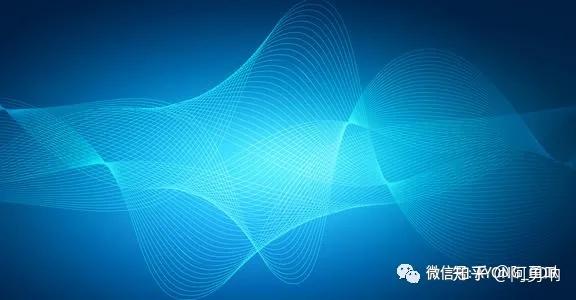
提到科技感色系一般我们想到的就是蓝色系:科技蓝。我敢打赌95%的人一定会这么说,但是我想说:科技感可不是只有这种蓝啊~不是只有蓝色啊~[微笑]
蓝色色域也是非常广的,首先我们先看看普通的科技蓝~
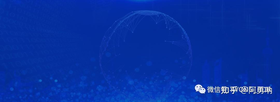
(反面教材)
蓝色色域也是非常广的,然后我们再看看其他的蓝色系~(正面教材)

能够表现科技感的色彩也是非常之多的~

蓝色并不是科技感的专有属性,任何一种颜色都是可以塑造科技感的感觉的。我们可以推断,配色是塑造科技感界面的一个比较重要的因素。
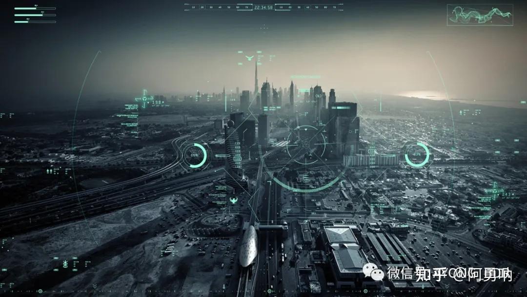
色彩的选择需要根据实际所运用到的场景,比如安全行业,蓝绿色会比较好一点;比如公安行业,传统蓝色就比较合适;比如卫星地图,用蓝色就不合适;根据不同的业务范畴以及不同的应用场景去确定配色,这才是我们要做的。
比如适合用绿色的场景我做的不好看,那只能怪自己学艺不精,跟配色无关!我不排斥蓝色,但是我讨厌到处都是用蓝色,上来就是用蓝色,抱歉,做不到。
1.2 背景
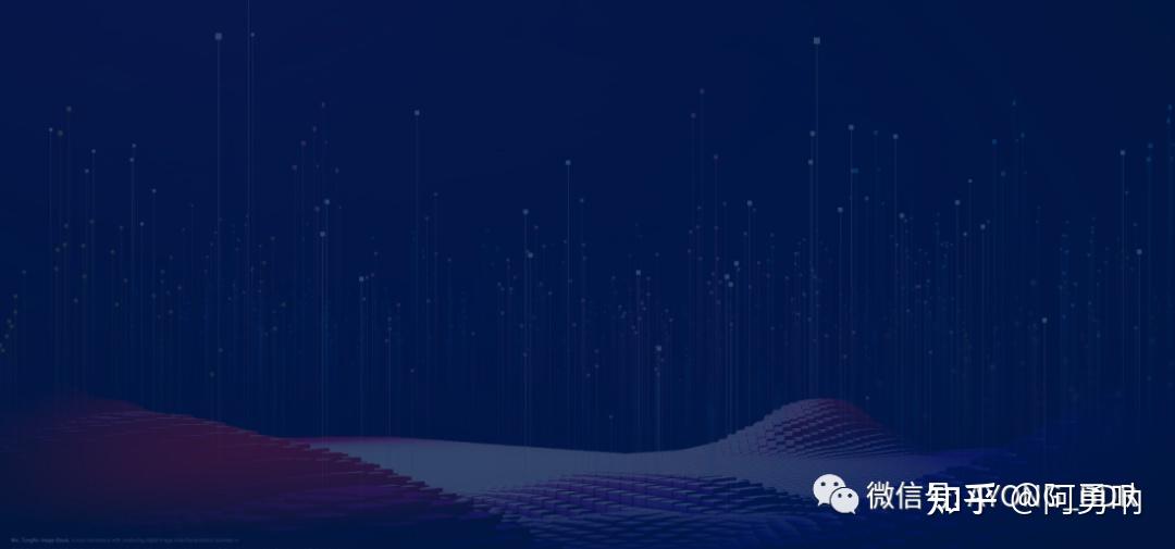
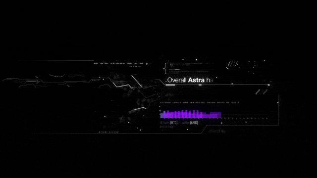
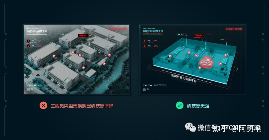
说到背景这是一个影响科技感非常重要的因素,一张超神比比皆是,一张超鬼也是随处可见,究竟什么样的背景才是一个优秀的可视化界面所具备的?不是画面发光,有闪光点,宇宙或者银河那种图;也不是科技点线,带渐变的线条(混合工具做出来的那种)看起来就特别复杂;也不是那种亮度超过画面任何一个元素的图。

科技感的背景所起到的作用应该是衬托画面,而不是在画面中比较跳,抢视觉,一大坨发光或者复杂的图形,只会起到反作用。
一个好的背景一定是不影响视觉的同时,衬托画面和主视觉,如果整个页面分黑白灰三层,那么背景一定是黑的那一层,这样出来的效果才会好。
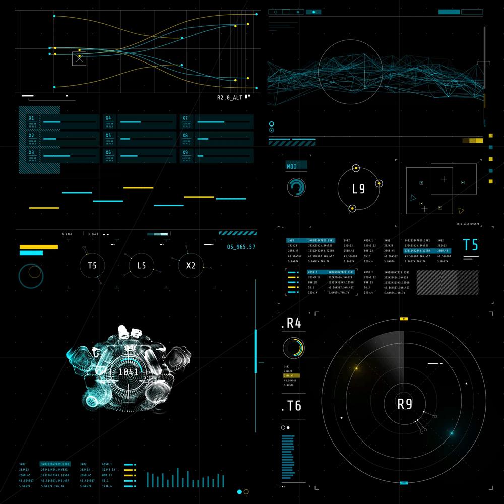
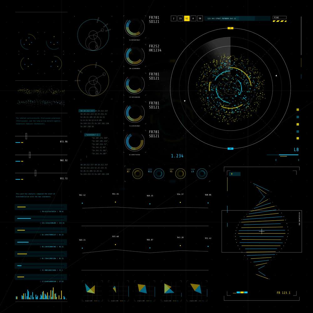
1.3 图形
图形应该是以上指标中,最令人可以接受对科技感风格诠释的一种,科技感的图形到底有哪些特征,我们又该如何去做呢?
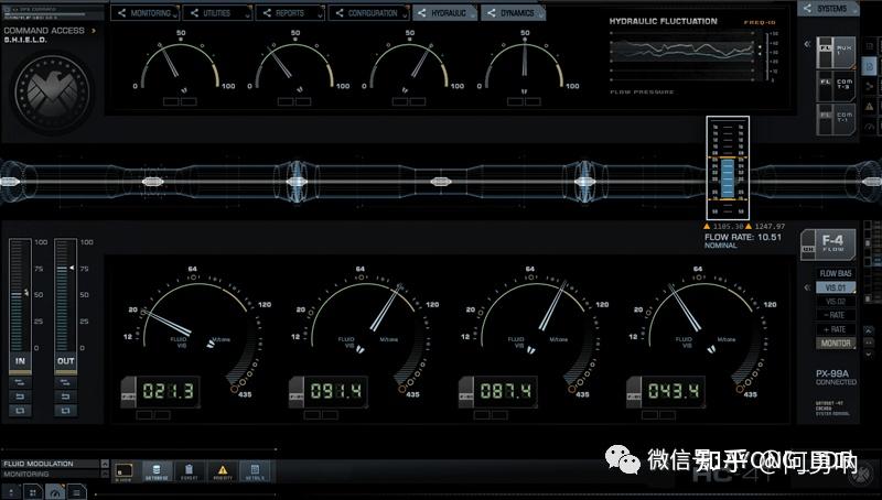
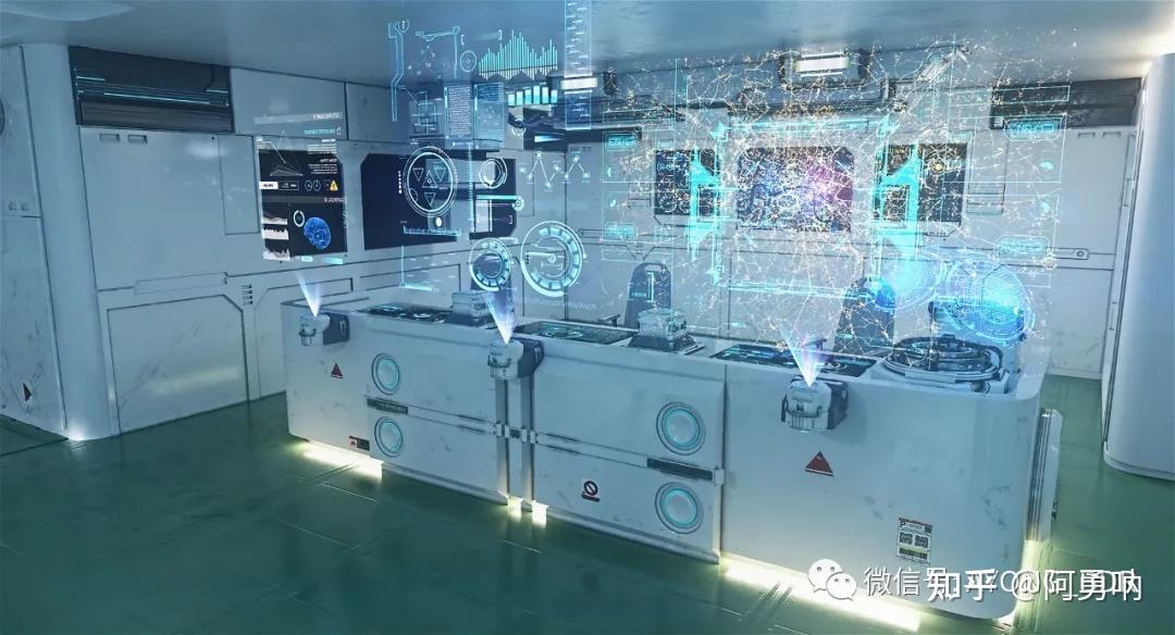
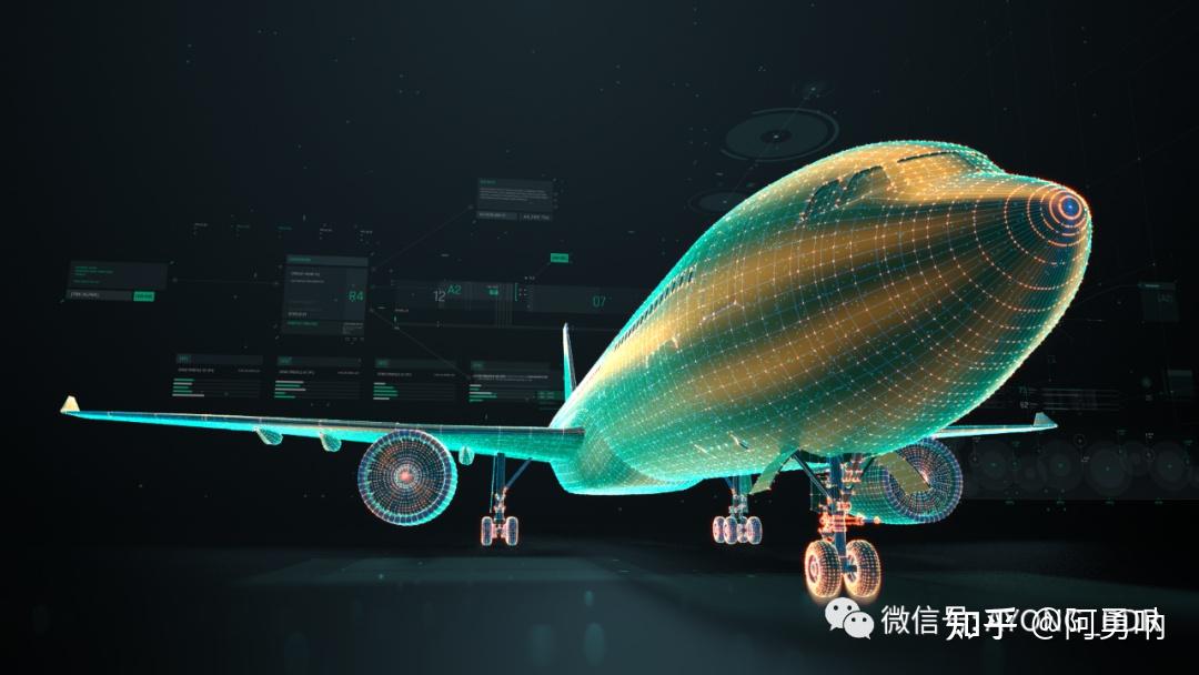
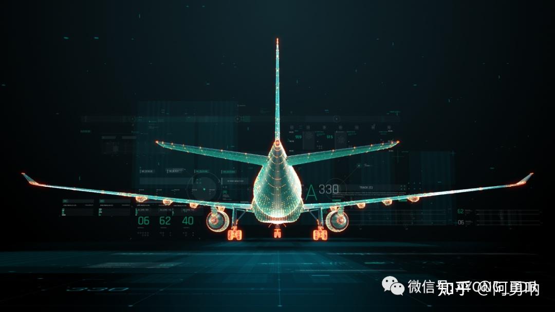
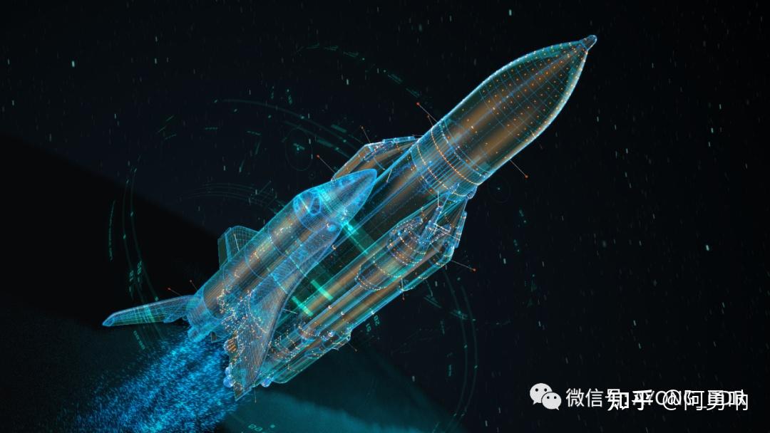
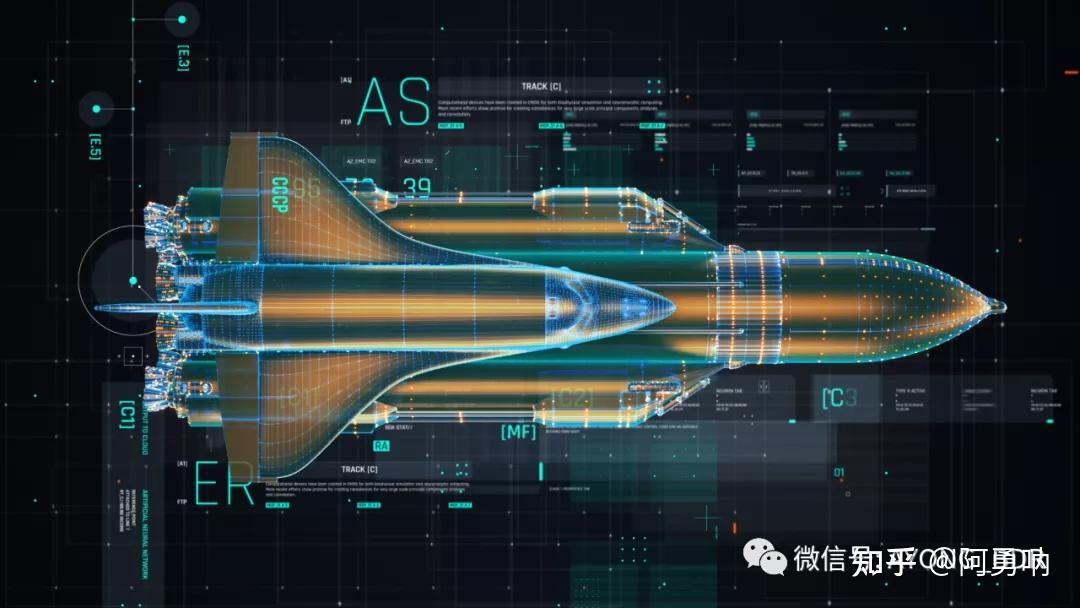
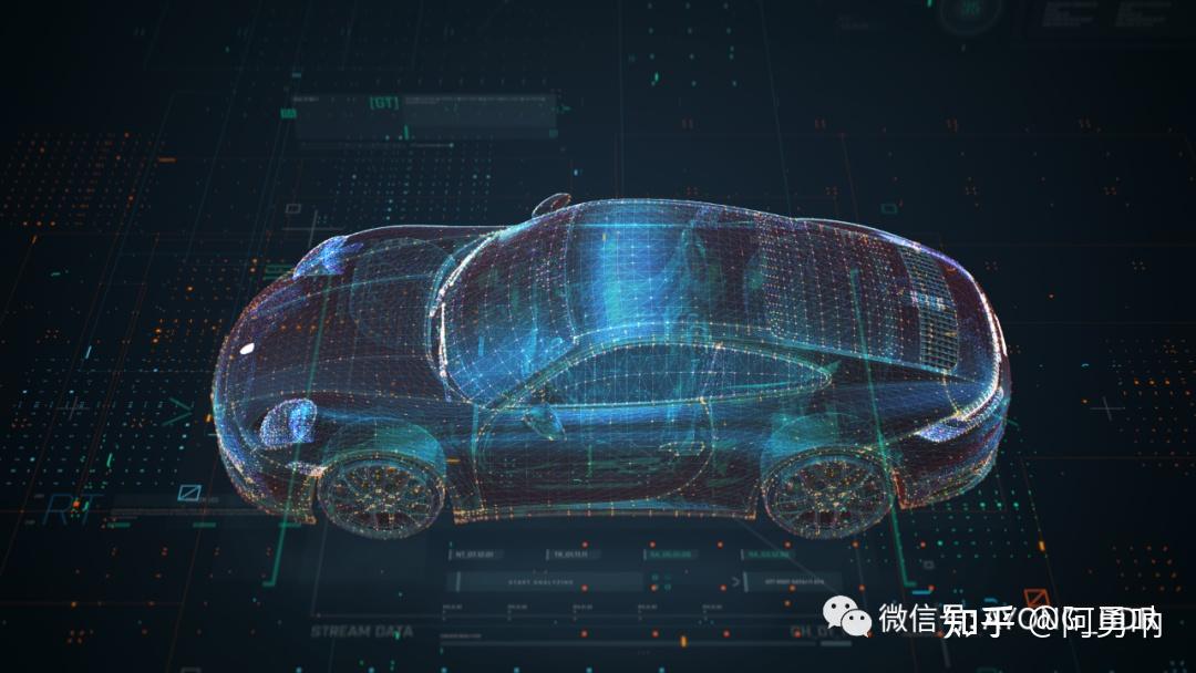
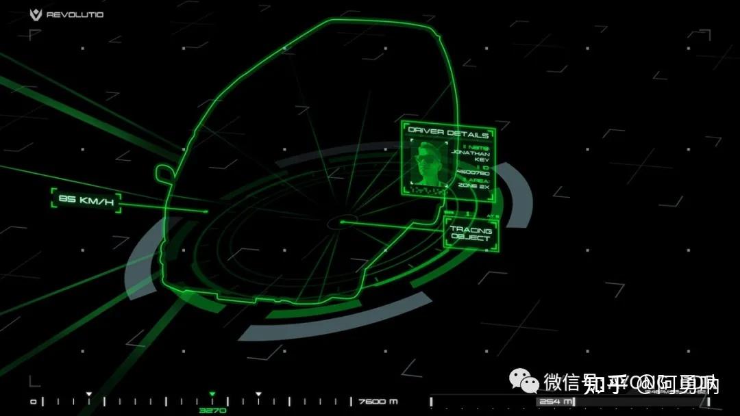
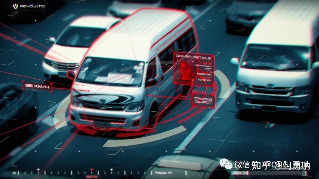
通过以上案例我们可以发现,所谓图形表现科技感,最大的特征就是点线面应用的多元化,通过一种或者多种规律将点线面组合起来,线条粗细长短不一,点大小不等。在使用图形进行点缀搭配时,切不可过于花哨,从而抢了主要内容的风头。不规则图形,点线装饰,色彩,外发光,都是图形诠释科技感的方式。
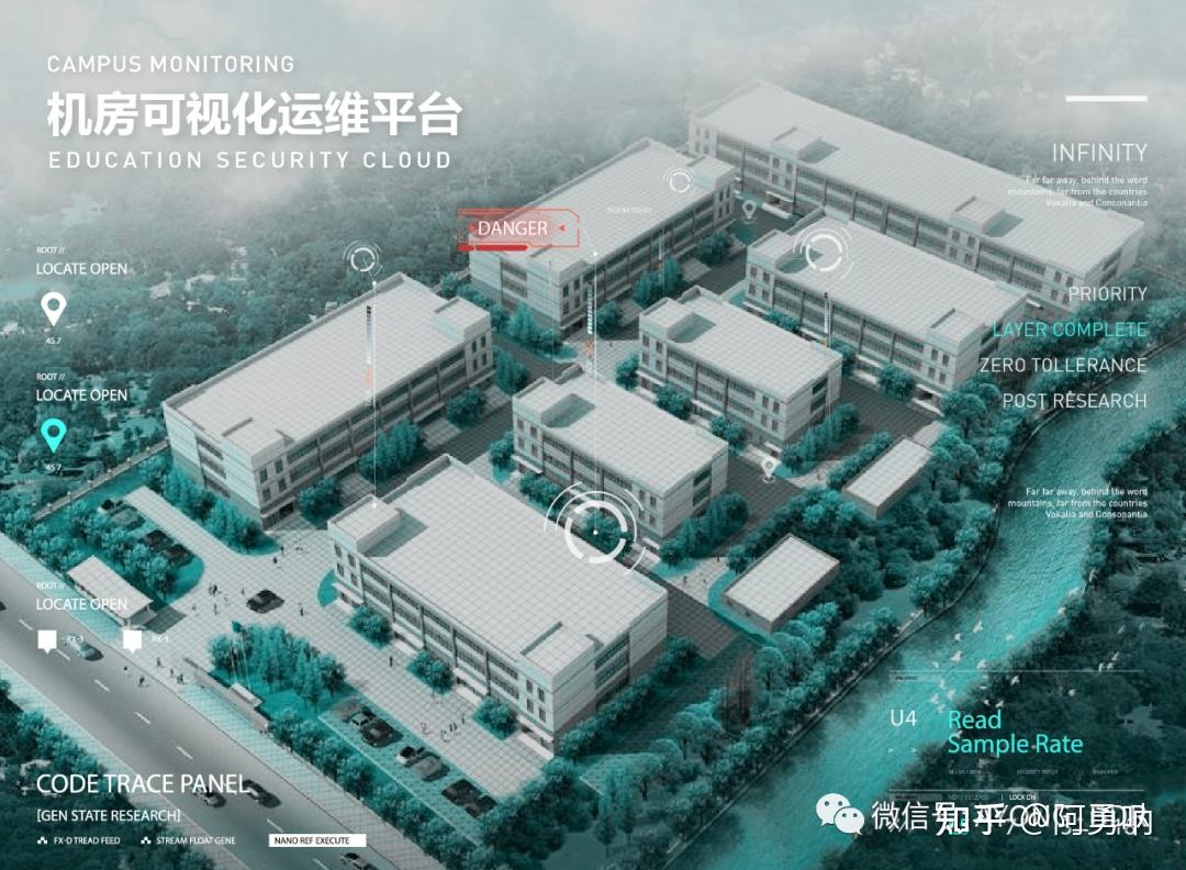
此处可能会出现一些三维样式的图形,特殊的视角以及不常见的设计都会增加科技感的元素,但是也不是所有的三维都可以比二维更有科技感的。我最近做的就是甲方客户一直觉得:三维元素太少了,科技感不够。我就纳闷了,到底什么才是科技感?难道科技感还只能用三维的来表示了?只能说一定条件下,三维是优于二维展示的,但这也不是绝对的。如果你的场景主视觉本身就是二维范畴的,何必要要求组件三维展示。
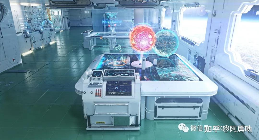
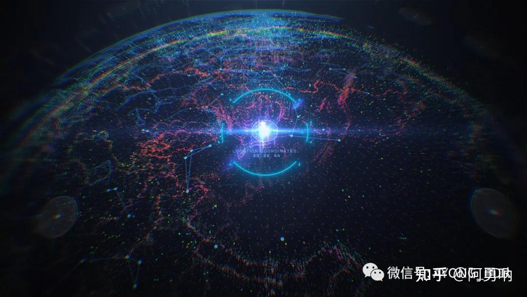
下图的二维科技感表现上肯定是超过三维地球的,至少我是这么认为的。
1.4 动效
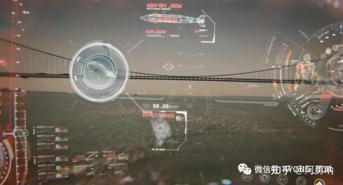
动效应该是最能体现科技感的方式了,通过动态演示组件,通过动效展示界面,远远比静态页面要合理的多。动效主要是通过:位移、旋转、透明度(闪烁)、缩放等方式去制作,形成独特的动画节奏。最常用的科技动画:粒子动画,线条动画,辉光,剪切路径,偏移字符等等。

可以发现科技感动效一般都伴随着极快的闪烁动画,动画的节奏也是比较偏快,再通过出现动画,字符偏移,剪切路径等演示组件的形成过程。
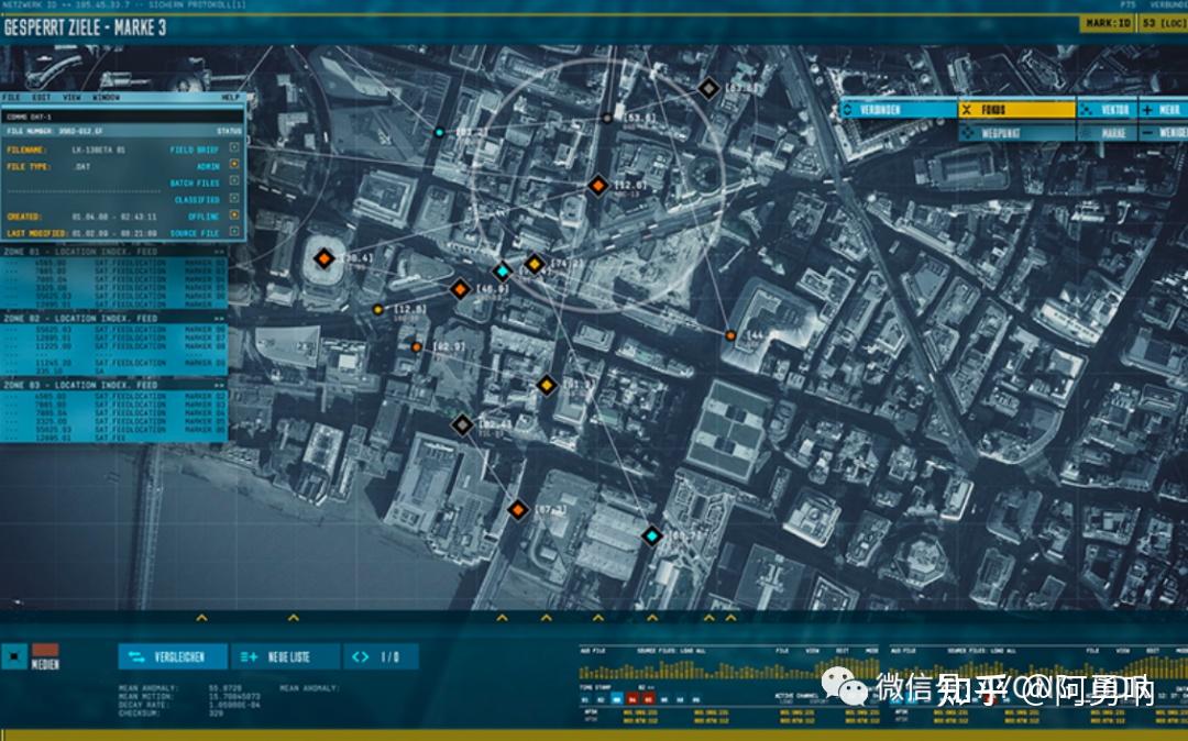
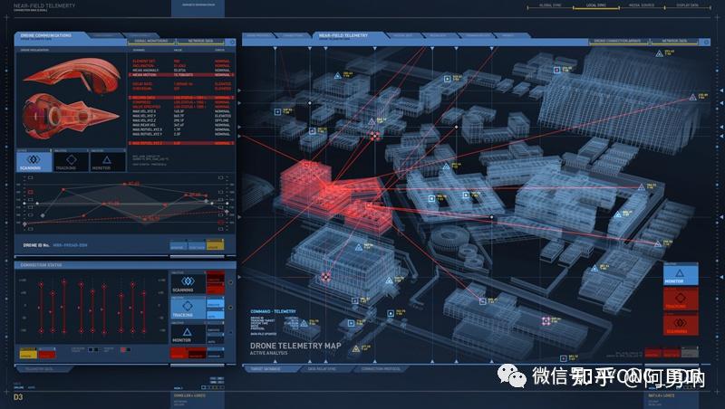
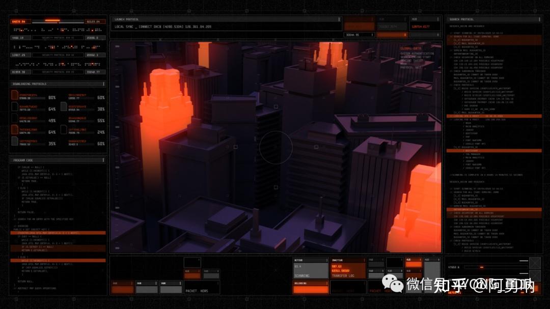
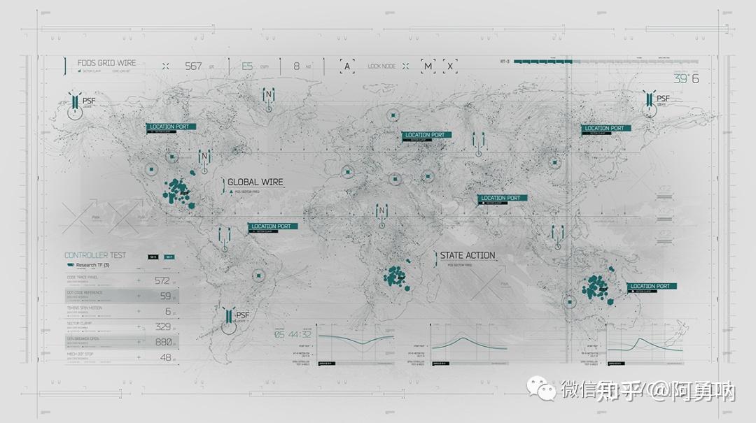
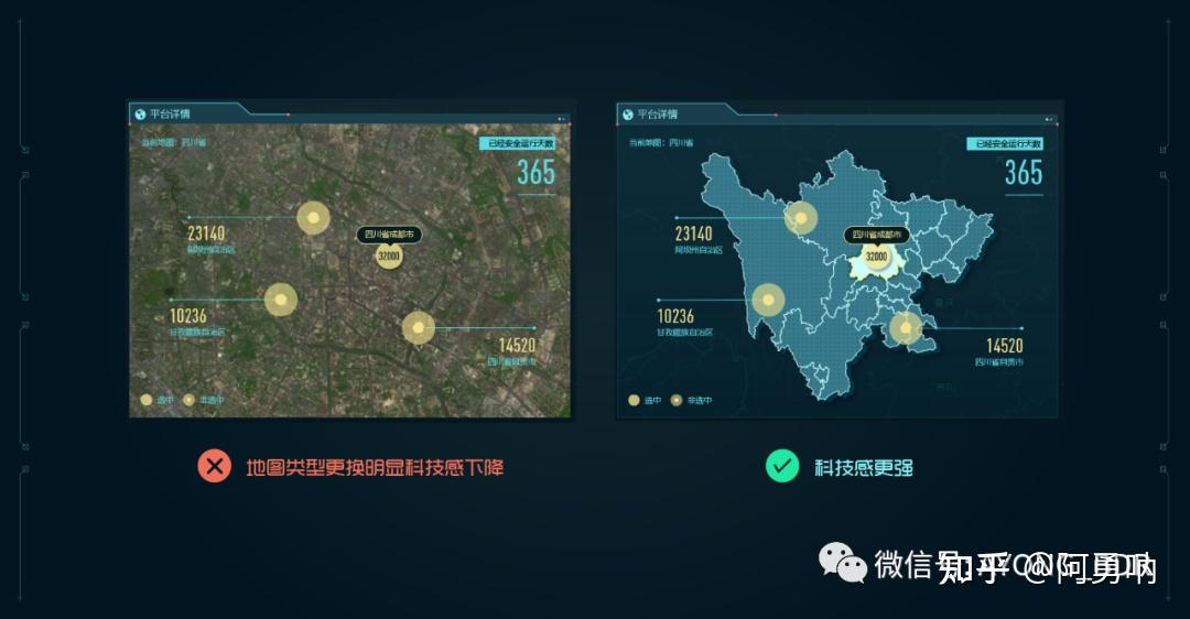
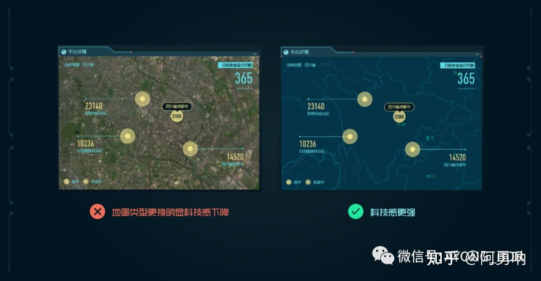
可能大家没有遇到过这种情况,比如在三维建筑可视化中,科技感本身就依赖于场景的表现,但是不知道大家有没有试过,将三维建筑可视化换成卫星地图之后,我们如何去使画面表现的更具科技感呢?
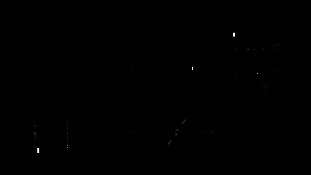
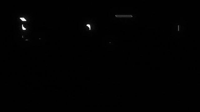
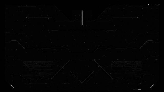
图一,图二,图三分别就是替换了人为认知的不好看的场景,那么我们来看看这些场景为什么不适合原本的之前的科技感风格呢,我们一起思考一下~
图一
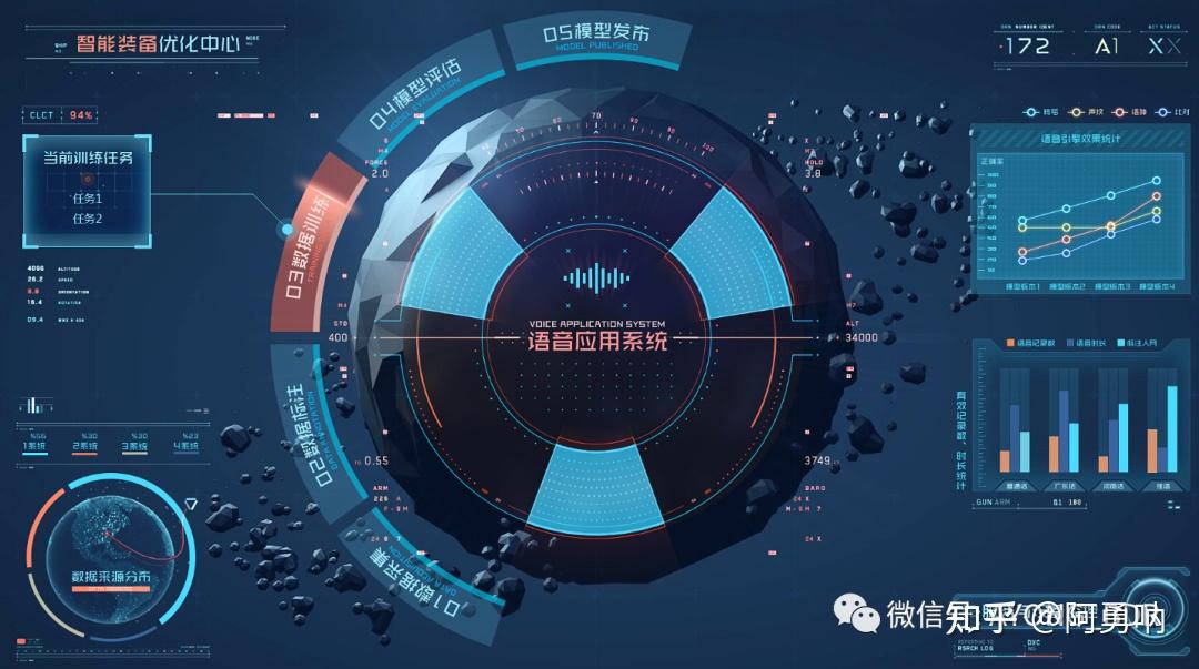
图二
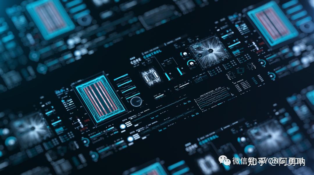
图三
以上三张图可以看出,大家会觉得科技感只针对于一些特殊的场景,或者说是深色场景,比如一些实景地图和卫星地图又该如何去表现科技感的元素呢?以第一张图风格为例,我给大家展示一下这样的科技感该怎么去做?科技感风格应用于不同的场景,那么表现科技感的方式也是有很大的不同的。
对于这种亮色系的场景,或者实景地图我们一般会多用白色,少量的运用色彩去修饰整个画面,上图的页面我也只是简单的排布了一下,大概就可以了解到对于实景地图或者 一些其他亮色系的主视觉我们该如何去表现科技感了,希望对大家有点帮助,多做一些关于这样的练习就能熟能生巧了。
其实这本身就是一个伪命题,三维表现对画面的冲击力是非常强的,对于画面视觉效果的提升有很大的帮助。不过是否所有的三维就是最合适的呢,这个也确实有待商榷。不过能肯定的是,一定程度上,三维一定会比二维更加具有冲击,更加具有科技感(首先必须要确定的是,此处三维一定是科技感点线组成或者说是线描类型的三维主体,而不是实景以及仿真的主体,当然并不是绝对的此处针对大多数场景下)。

我们可以通过以上图片看出,科技感一定伴随的是大量的点线装饰,画面主体一定是最突出的地方。而不是我有时候遇到的是:GIS地图就是很普通的样式,可编辑性不是很强,样式也比较老旧,对设计就会造成大量的困扰。在主视觉没有完美表现的时候,就不要强求说把两边去做好看,主视觉不好看,那么图表做的特别华丽也只是让主视觉更掉分。
其实最正确的表现就是二维表现加上三维场景展示,两者相辅相成,对于画面的展示才是最好的。通过下面这组案例可以发现,二维表现加上三维场景才是最优解。
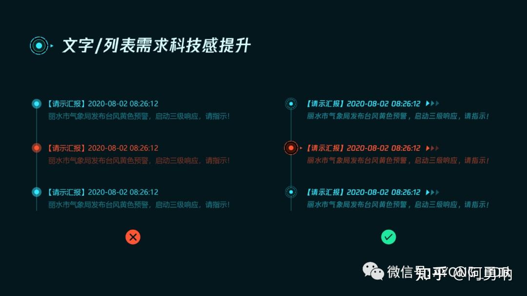
很多同学对于文字需求如何制作科技感有很多的疑问,通过我最近的作图,总结出四种关于文字排版科技感的展示,总结起来其实就那么几点:装饰,图形,字体,版式,表现形式...
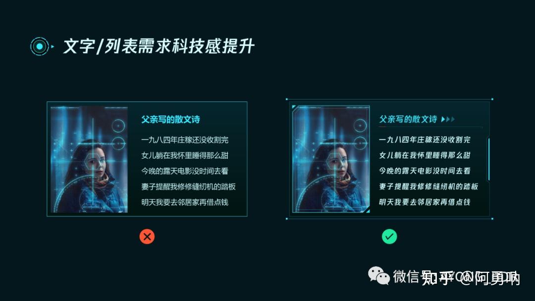
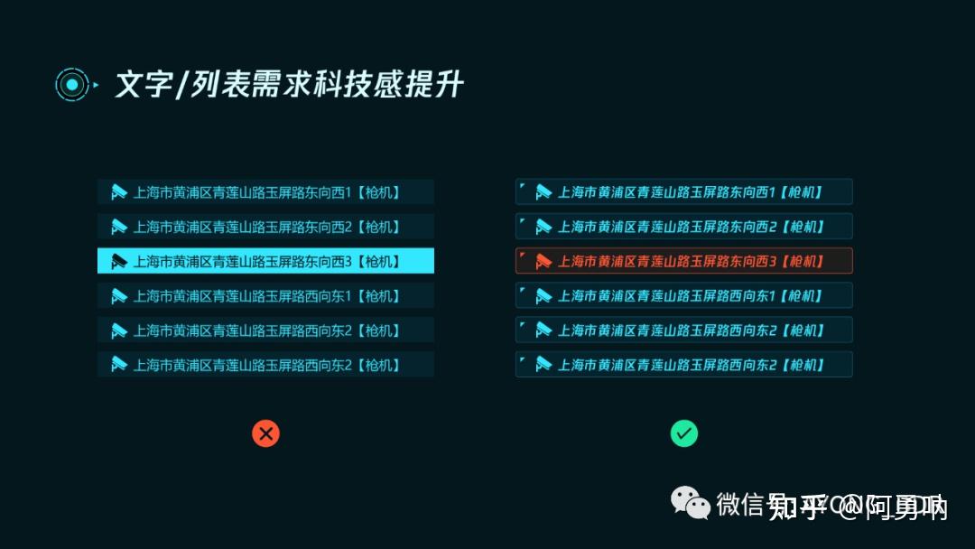
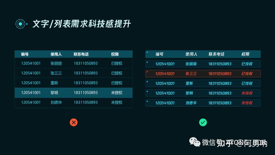
其实对于数据可视化设计科技感的研究,不仅需要了解表现层,更需要上升到业务层。一些特定的图形或者装饰,对于画面的丰富程度一定是有帮助的。讲了这么多,不知道对大家理解科技感是否有帮助,如何提升画面科技感,是我们做为数据可视化设计必定会面临的一大难题。希望大家在以后的工作或者项目中,多多酷炫,多多科技感!!!
不知道大家有没有一种错觉,突然有一段时间,某个时候发现自己突然不会做设计了,啥也想不明白了,莫名的有点浮躁,做什么都不能专心。其实很简单,总的来说就是,你即将突破现有的设计水准,如果能想明白,解决掉问题,你的审美以及设计水平都会有很大的进步~这就是别人口中的,突然就会了,知道怎么做了,其实无非就是积累够了,需要升入下一个等级了
~文章的最后,呼吁一下大家,多思考,多练习,多临摹。